Acceptance (60 x 43.5 cm)
- Dave Curator
- Jun 1, 2023
- 2 min read
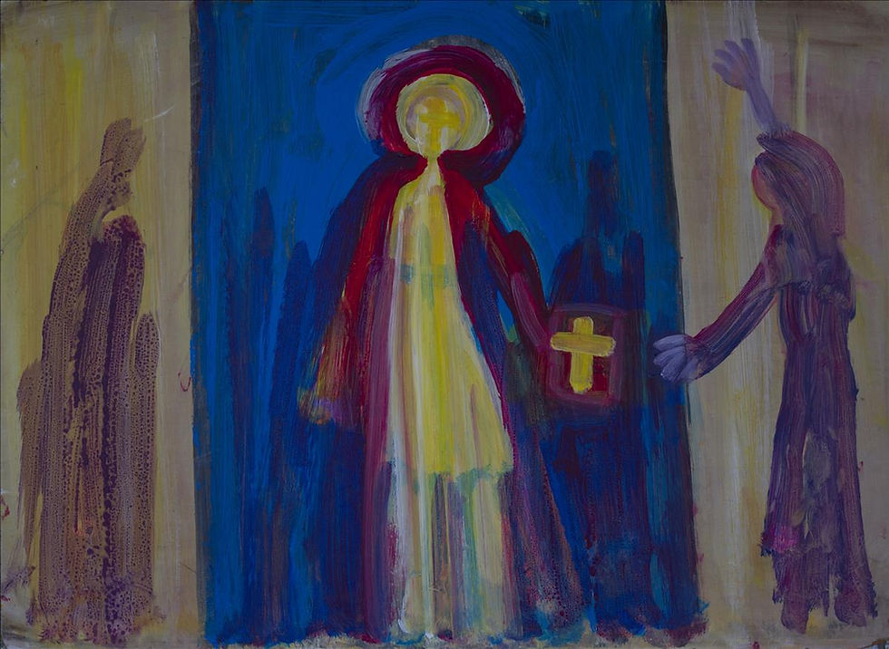
In this painting, Acceptance, the artist has provided a fascinating study in the three primary colours, red, yellow and blue, and a secondary colour, violet. The colour violet is the result of a red-blue paint combination. Violet and yellow are complementary colours and are opposite each other on the colour wheel, but when placed close to each other on the canvas, they interact, and stimulate the viewer’s senses. The effect of the colour interaction in this painting is optical.
The principal subject of the painting is the red robed figure who has been placed centrally on the canvas, and this man or woman of God draws the viewer’s attention. However, it is the secondary subject, the woman on the right who holds the lingering attention of the viewer. She is having an Epiphany and allowing the Holy Spirit to enter her life. She is raising her arms widely to express her joy.
In the painting, the source of light is entering the canvas from the right, and it projects the woman’s shadow on to the wall opposite. Notice, as the shadow is less important than the secondary subject herself, the artist has applied a thinner layer of paint and made the shadow a little shorter.
Brushstrokes in this painting are mainly vertical, excepting for the semi-circle around the principal subject’s head, and the arms of the crosses on the Holy Bible and the main subject’s face. The different shades of blue used in the background give the painting a textured appearance and keep it interesting.
All three figures are well placed on the canvas and the painting is well balanced. Red and blue colours are often used in religious paintings.
Acceptance is a very modern and dramatic painting. The colours are representative of persons who have strong convictions, and passionately joyous experiences.
Acrylic on Masonite, later career.
Comentarios